Thursday, March 3, 2011

Paula Scher (Project 5)


For our fifth project we were to pay homage to a famous graphic designer by designing a logo for their name and using it in a bio poster.  The designer I chose was Paula Scher and the first step was research.  I found a large amount of her work (above) and learned that she was a leader in the retro design movement with her different approach to typography.  I was attracted to her design because it had a very clean feel even though the way she places her type is all over the place.
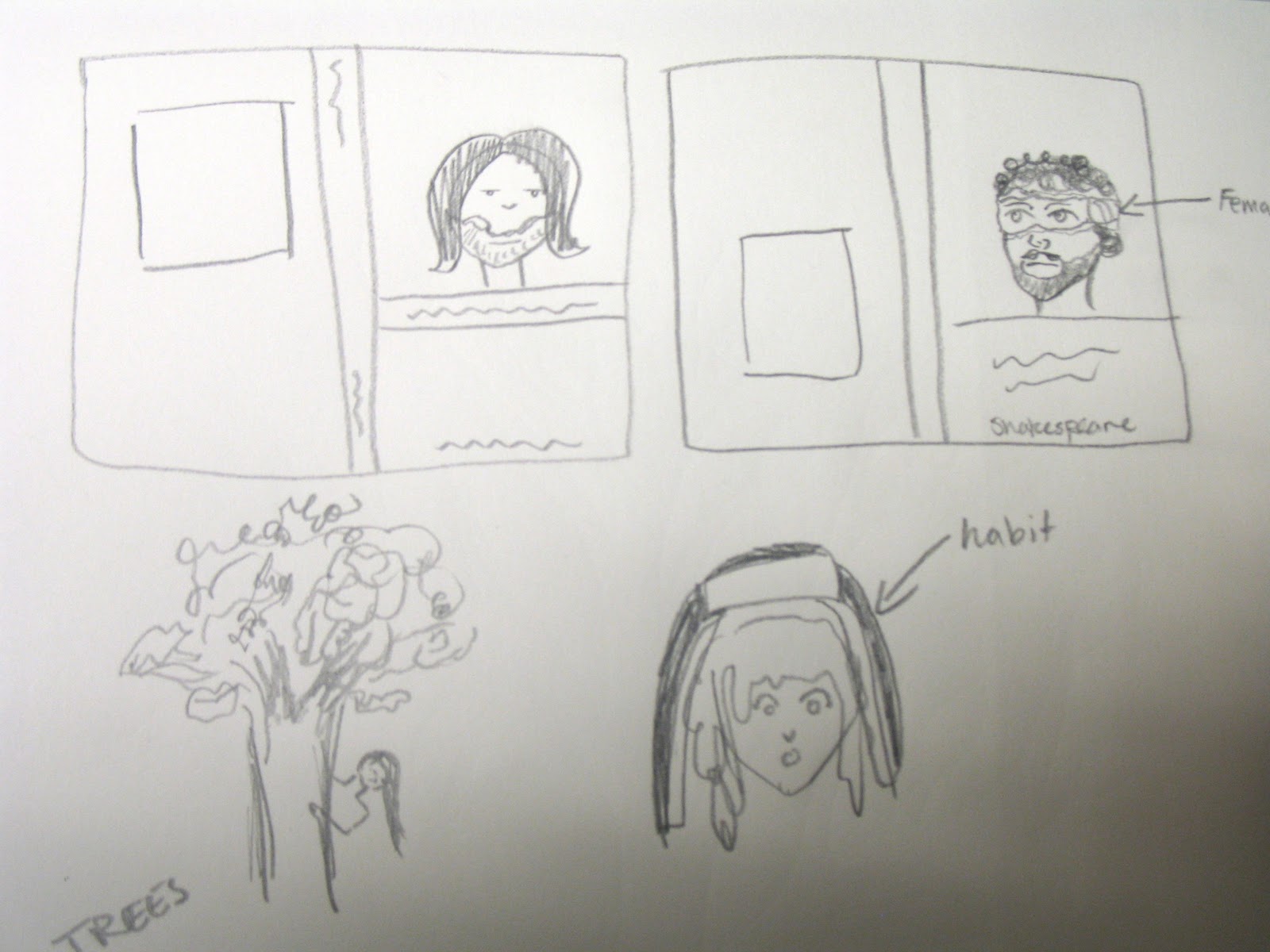
So I started to sketch ideas before I went to the computer.  What I wanted to do was somehow contain her name.  Also there needed to be strange angles somewhere.  These are some of the initial sketches.  


I then went to the computer and put down some solid ideas. (below)  They were printed out and put on the “war wall” and I got feedback from the rest of the class on what was working and what was not.   


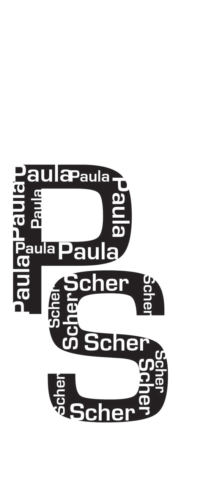
After some more ideas I finally chose a logo (last one in the one above).  It combined the container style used in her “Ballet Tech” poster and the angles that come up in a lot of her works.  Also, the font I used (Eurostile) is a san serif font because she used san serif fonts in a lot of her work.  
On to the bio poster!  First up was a lot more research.  Prof. Davis let me borrow a few of her books (Megg’s History of Graphic Design by Philip B. Meggs; Women of Design by Bryony Gomez-Palacio and Armin Vit; Graphic Design History: A Critical Guide by Johanna Drucher and Emily McVarish.) and I pulled out all the information about Scher and her influence on the Graphic design community.  Then I had to narrow that information down.  I ended up including her education, employment, clients and what she works with for the basic information as well as a paragraph about her design influence.  Finally I used a few of her own quotes from an interview that I thought really illustrated her character and her outlook on design. 
            Now it’s time to lay it out on the poster.  We had to use a picture of the designer, but in an interesting way, so that was the first thing I did.  I found a picture of her and cut her out and placed her in the corner of the poster.  I didn’t like how it looked though so I put it through live trace just to see what it would look like and it came out looking really interesting.  So I made her blue and the background yellow, a color scheme seen in some of her works.  Then I added the logo and put it in the center of the poster.  The rest of the information came after that and in keeping with the angles that she used I tried to align the information with the angles of the logo.  The final step was to bold the important things, add some more blue, and make sure that all the text was aligned correctly and I ended up with the final product below.    

Sunday, February 20, 2011

Covering Shakespeare (project 3)


Our third assignment was to create book covers for three of William Shakespeare’s plays.  Out of the list I chose As You Like It, Measure for Measure, and Twelfth night.  I wanted to create a similarity between the covers so I tried to pick plays that had similar plot lines.  In As You Like It and Twelfth Night there is the similarity of women disguising themselves as men.  Though in Measure for Measure there was no cross dressing there were many times where people were to pretend they were someone else, which fit in with the theme.

            So I started brainstorming (as shown above).  I knew I wanted to use faces on the covers to tie them all together. I came up with the idea, for Twelfth Night and As you like it, to find a woman’s face and a man’s face from magazines and to combine them to make one face.  This however would not work for the third book, but I happened to find a very surprised looking lady and thought she would be a perfect fit for the nun in Measure for Measure.
            As I was going through the magazines I came across a tree made out of vitamins for a health store and cut it out.  I wanted to use it to represent the forest in As You Like It, but I wanted it to look more like a tree and less like crushed up vitamins.  So I cut it out and traced it and then colored it in solid black, leaving some space between the leaves and the branches to make them distinguishable.  I decided then that I would use it on the back cover along with the blurb about the story.  To keep the similarity going I needed a ship (drawn from a photo I had taken of a tall ship) and a guillotine (drawn from an online image) for the backs of the other two books.  These were then scanned in (shown below) scaled and cut out to be placed on the back with the blurbs.

                                                                                                                                                                   
            I wanted the blurbs to stand out from the background, but I didn’t want them printed on a solid paper.  To compromise I bought some velum and printed on that.  The velum does not cover up the texture of the background, but blurs it sufficiently enough so that you can read the text easily.  As for the rest of the text, I printed on transparencies.  The type used for the titles was bold enough that I wouldn’t have to worry about losing it to the background.  The backgrounds are scrap-booking paper.
            For the front covers I went through magazines and cut out faces that looked like they could be combined.  I scanned in the ones I thought would work and scaled them to match each other in size.  I then printed them and tried different ways of tearing and cutting until the two different faces formed one face.

                                                                                                                                                                 
           Now with all the pieces made I had to place them on the covers.  At first I had the text and the images separate from one another, thinking that I needed to spread them out, but Professor Davis suggested using some overlap in order to bring them together.  After playing around with the pieces I eventually taped them in place (seen below).  They were now ready to be scanned into the computer.

                                                                                                                                                                     
            After scanning them in I removed the lines from the transparencies and tape the best I could and got rid of any other blemishes that showed up.  Then I spent a good half hour trying to figure out the printer, but eventually got it to work and thus the finished product.   


Wednesday, February 2, 2011

Music and Arts Festival (Project 2)


For this project we were to design a logo for the Westerville Area Chamber of Commerce Music and Arts Festival.  The first step in the process of creating my logo design was meeting with the Westerville Area Chamber of Commerce representative.  We all asked questions about what information was to be included where, what they were interested in seeing in the logo, and looking at old logo contest winners.
We then took all this information and hit the paper.  First thing first was to brainstorm and put some thumbnail sketches down.
 
Then I picked three different ideas that I thought I could use as a logo. 
I then drew them out larger and made sure all the information that needed to live in the logo had a place to be.  After this we took these images to the Xerox machine and blew them up.  These images were transferred back to my sketchbook by covering the back of the paper with graphite and tracing the logo.  I then traced it again with pen to make it really clean looking.  These are the result after they were scanned into the computer.


These scans were imported into Illustrator and put through the live trace process.  This turned my scan into a group of paths that could be manipulated and cleaned up even further.  Now I was able to start filling the spaces with color.  We were limited to two or three colors so I went on Kuler.com and found some color palettes that I thought worked well.

The concept for the final logo that I used (seen below) came about through a combination of a few different ideas.  I knew I wanted to use the image part of the logo to create a part of the font used.  This was done by connecting the A in art to the neck of the guitar.  Brainstorming things made of a similar shape gave me the idea for turning a paint palette into the body of the guitar.  


Tuesday, January 11, 2011

I Wish it Would Rain (Project 1)

For this project we had to create an image using only the lyrics from a song by Gladys Knight and the Pips.  While listening to her music I heard alot about peace and love, but I also heard about heartbreak and sorrow.  I tried to reflect that in my thumbnail images in my sketchbook.

  I wasn't to familiar with her work until I heard "I Wish it Would Rain".  My father had sung a version of this song in a band he used to be in so I thought I'd pay tribute.  The sketch of the eye (above right) is what I decided to base my image off of.  I then sketched out another, simpler version on a larger sheet of paper and started plotting out where the different verses would go.  When trying to construct the base image of the eye I had to chose lines in the song that would be long enough to make up the lines of the eye that I needed. The rest of the lyrics that were left over (after the basic construction) were then used to create the eyelashes and eyebrows.
  I chose a couple of fonts.  Cooper Black for the bolder lines in the eye, and Handwriting Dakota for the eyelashes and eyebrow.  I constructed the parts of the eye separately on tracing paper and then taped them all down where they formed the rough image of the eye (seen above).  This was then placed in the xerox machine and copied, making it easier to see and ALOT less smudgy.
  I then covered the back of the Xerox copy with graphite, creating a "carbon copy" type paper... only with graphite.  This paper was then placed graphite down on the illustration board where it was taped down and traced again.  This made a ghost print of what I would be inking.  This ghost print was then traced yet again in ink.  In the picture below I am halfway through inking, to show the difference between the ghost copy and the ink. 
   When I was inking I traced all the cooper black writing first and then filled it in once all the other tracing was done.  For the crease above the eye and for the outline of the iris I used stippling instead of solid black because I didn't want it to compete with the outline of the eye and the eyebrow/eyelashes.  I'm pretty pleased with the final product.