Our third assignment was to create book covers for three of William Shakespeare’s plays. Out of the list I chose As You Like It, Measure for Measure, and Twelfth night. I wanted to create a similarity between the covers so I tried to pick plays that had similar plot lines. In As You Like It and Twelfth Night there is the similarity of women disguising themselves as men. Though in Measure for Measure there was no cross dressing there were many times where people were to pretend they were someone else, which fit in with the theme.
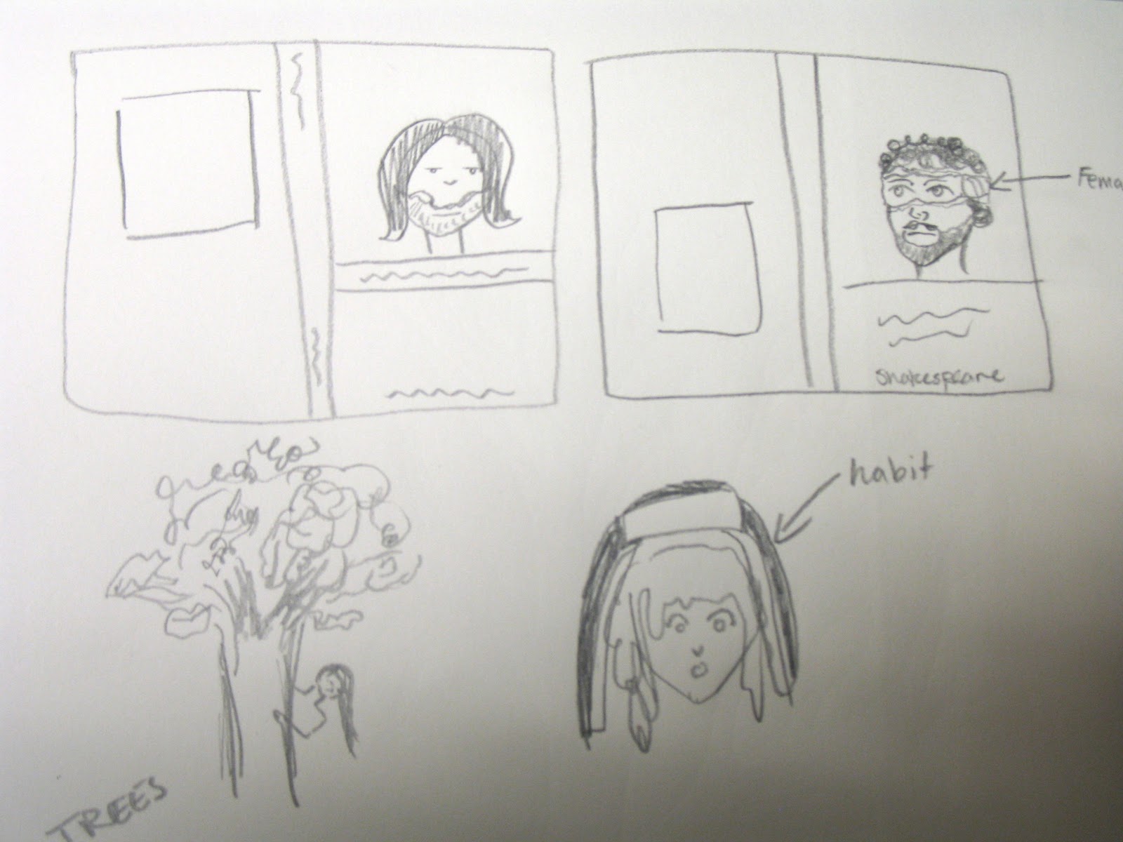
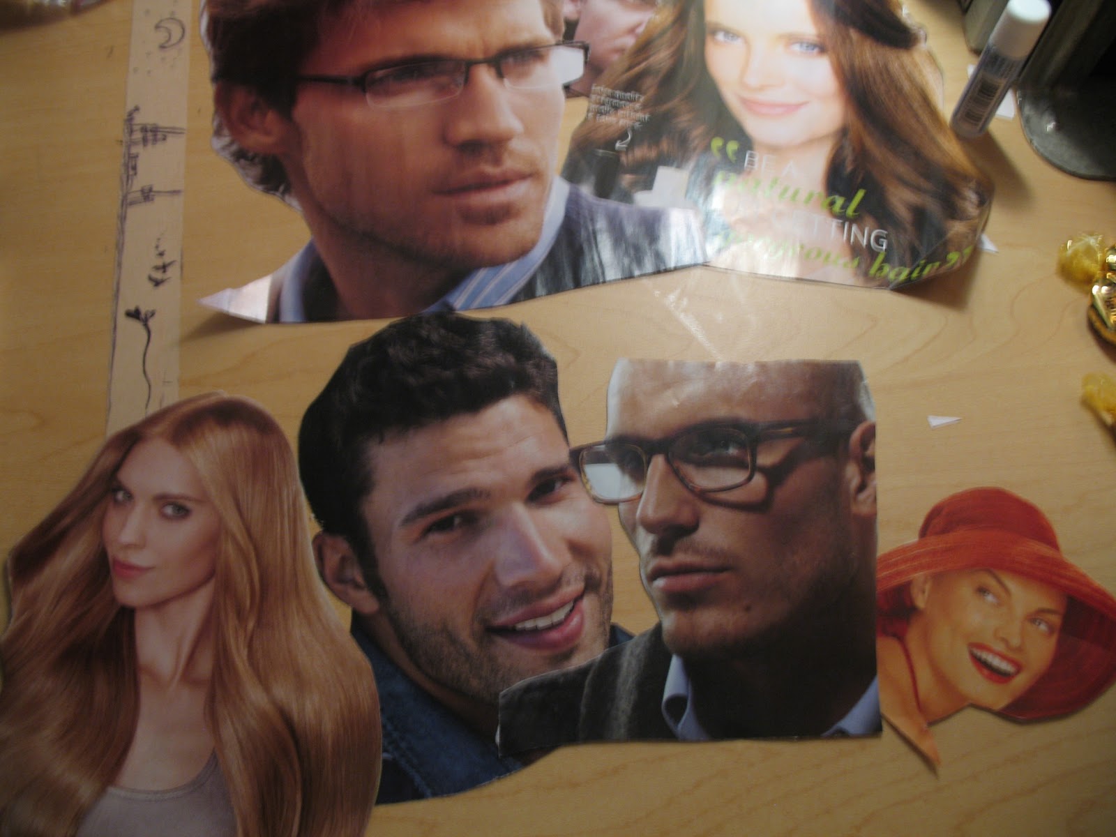
So I started brainstorming (as shown above). I knew I wanted to use faces on the covers to tie them all together. I came up with the idea, for Twelfth Night and As you like it, to find a woman’s face and a man’s face from magazines and to combine them to make one face. This however would not work for the third book, but I happened to find a very surprised looking lady and thought she would be a perfect fit for the nun in Measure for Measure.
As I was going through the magazines I came across a tree made out of vitamins for a health store and cut it out. I wanted to use it to represent the forest in As You Like It, but I wanted it to look more like a tree and less like crushed up vitamins. So I cut it out and traced it and then colored it in solid black, leaving some space between the leaves and the branches to make them distinguishable. I decided then that I would use it on the back cover along with the blurb about the story. To keep the similarity going I needed a ship (drawn from a photo I had taken of a tall ship) and a guillotine (drawn from an online image) for the backs of the other two books. These were then scanned in (shown below) scaled and cut out to be placed on the back with the blurbs.


I wanted the blurbs to stand out from the background, but I didn’t want them printed on a solid paper. To compromise I bought some velum and printed on that. The velum does not cover up the texture of the background, but blurs it sufficiently enough so that you can read the text easily. As for the rest of the text, I printed on transparencies. The type used for the titles was bold enough that I wouldn’t have to worry about losing it to the background. The backgrounds are scrap-booking paper.
For the front covers I went through magazines and cut out faces that looked like they could be combined. I scanned in the ones I thought would work and scaled them to match each other in size. I then printed them and tried different ways of tearing and cutting until the two different faces formed one face.

Now with all the pieces made I had to place them on the covers. At first I had the text and the images separate from one another, thinking that I needed to spread them out, but Professor Davis suggested using some overlap in order to bring them together. After playing around with the pieces I eventually taped them in place (seen below). They were now ready to be scanned into the computer.

After scanning them in I removed the lines from the transparencies and tape the best I could and got rid of any other blemishes that showed up. Then I spent a good half hour trying to figure out the printer, but eventually got it to work and thus the finished product.


